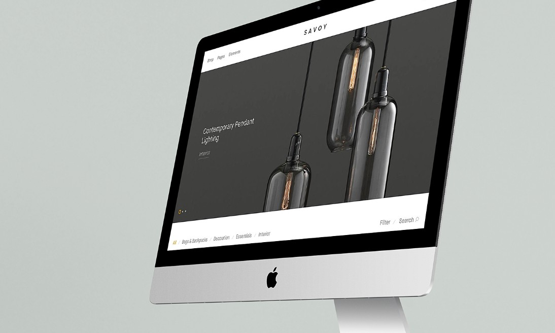
Product pages are the pages on a website dedicated to selling the products or services offered by a company. Unlike other web pages such as home pages (which are primarily informative), a product page is designed to inform and persuade, which means that it should ideally lead the customer to click the “Add to Cart” button. This is also why creating a product page is a challenge, because a beautiful design is not always a design that generates a lot of conversion.
The aesthetic choices must be even more strategic than usual to make visitors want to have the product in question in their hands. To help you in this process, we have developed this ultimate guide that will allow you to create a successful product page.
The objectives of a product page
–
The ultimate goal of a product page is to generate sales. But to achieve this goal, the page must first accomplish several things.
It must explain what is for sale. A product page must show the visitor what the product in question looks like, how it works, and how much it costs
It must establish trust. A first purchase is an act of faith, especially when ordering online. The product page of your site must anticipate and allay any doubts that visitors may have
It must create an experience. A good product page will use convincing images and text so that visitors feel that what they see on their screen is real.
It must be intuitive. A product page should achieve all of the above objectives without bombarding the user with information
Setting up an online store using Jimdo is a fairly painless process — and you can do it quite quickly. You can add products, set terms and conditions for your store and create automated response emails easily.
Product page goals vs. consumer goals
The goals of the product page must actually align with the goals of the consumers. Consumers are on the page because they are looking to satisfy a need.
Assuming that the product you’re offering is the solution to their problem, it’s your product page that needs to persuade them that it is. And if your product doesn’t meet the consumer’s need, that should also be clear from the start.
All of this involves, of course, understanding the needs of consumers. You must first understand what audience your product is intended for, as well as the types of products and web pages they are used to interacting with.
Demographics, surveys, interviews and psychographic profiles are all common techniques used to define a target audience. Designers must then translate this information into psychological principles through their design.
Product page content
–
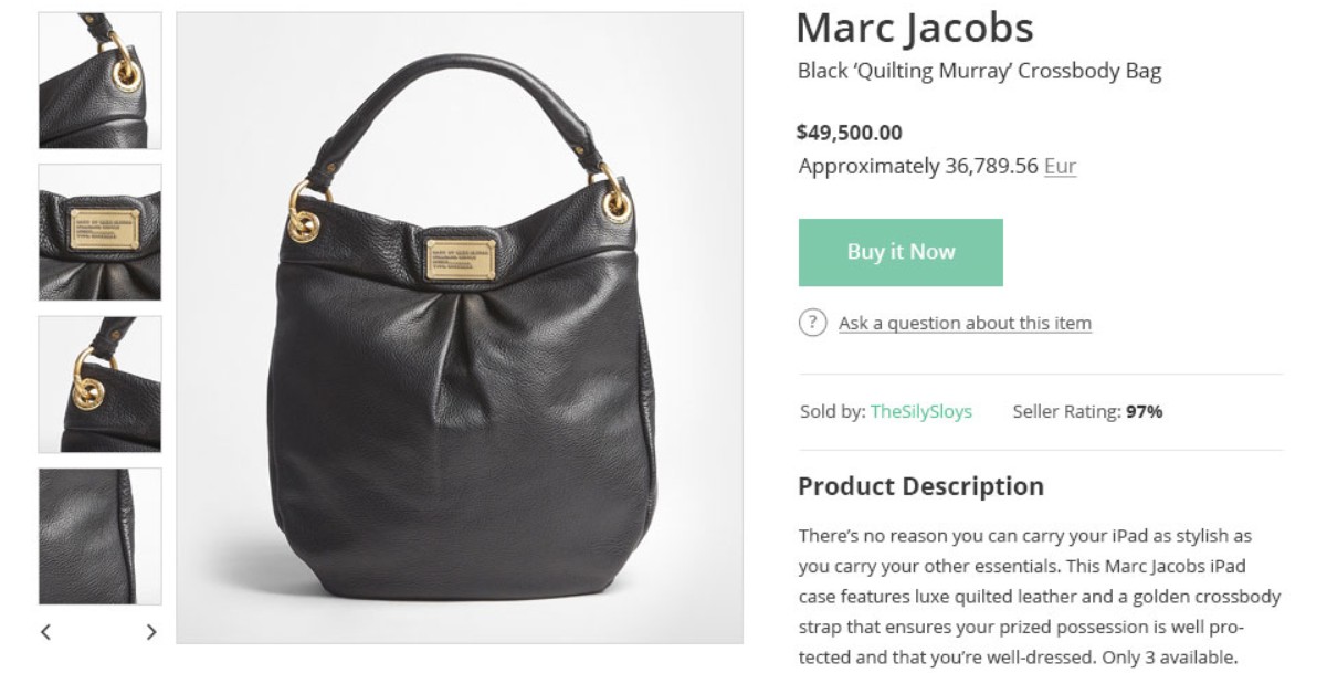
The basic content of a product page is structured around the waterline, which is the point where the bottom of the screen intersects the rest of the page.
Since the user must scroll down to see what is below the waterline (in other words, they must make an active choice to continue navigating), the part above the line is where the most important information should be:
The header: it contains the brand’s logo and navigation options. This is a standard element of most web pages, so it doesn’t need to be particularly large. Many brands opt for a smaller version of the navigation, even on the desktop version of their site, with a “hamburger” menu for example.
Product description: contains the product name, price, value proposition and sometimes an overview of customer reviews (e.g., star rating). It essentially identifies the product and succinctly explains why the visitor should buy it.
Product images: these are the main images of the product, usually presented in a carousel allowing the visitor to switch between different angles. They can also be viewing options, such as different colors or patterns.
The call-to-action button (CTA): This is the button that leads to the shopping cart. Options such as quantity or size are located near the CTA button.
The other items we will list do not necessarily have to be placed below the waterline, but are less essential than the items listed above.
Additional information: this is more detailed information about how the product works (weight, dimensions, FAQs, composition of specific parts, etc.)
Customer testimonials: these are customer reviews and lists of brands or well-known people who have already used the product in question.
Accompanying graphics: these are non-essential images that nevertheless facilitate scrolling (illustrations, animations) and give the page a more interactive and lively appearance. These graphics are generally linked to the general branding of the site.
Recommended products: this is a list of other similar or complementary products that the visitor might want or need to buy. These products can give visitors the opportunity to continue browsing other product pages rather than simply leaving the site, if the first product they were interested in did not convince them.
Product page content depends on the products in question
The content of a product page can vary depending on the nature of the product or service in question. The most common difference is between physical and digital products.
Physical products have an inherent disadvantage to being in the digital space, and the goal of their page content is to substitute for the traditional store. This can be achieved by devoting more resources to images, detailed product descriptions, and a focus on delivery and refund policies.
On the other hand, physical products such as candles or wine, which rely on non-visual senses, tend to mimic digital products in their page strategy (i.e., emphasizing descriptions). But since these products are limited by personal tastes, the current trend in this sector is to have visitors take quizzes before arriving on a product page.
Visitors are asked (fun but strategic) questions about their preferences to give them the impression that the product page they will see next has been designed specifically for them.
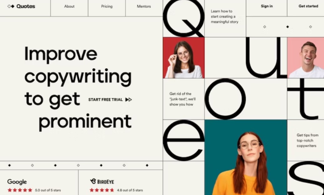
Some digital products or services may not have the ability to display images because the product in question simply cannot be photographed. It is also common for a product to be new or unfamiliar. Therefore, more time needs to be spent establishing who the brand in question is and what it offers. This is why the price is often announced at the end, when visitors have all the information they need to understand what it is.
Physical products, on the other hand, can afford to be more direct in this regard. A t-shirt is a t-shirt. Either you think it looks good enough to buy it, or you don’t…
Best practices for creating a product page
–
Now that we’ve gone over the basics of how a product page works, let’s deliver some tips for creating a good design, along with some examples.
1. Use the right design software
The design process usually starts with a briefing or list of required features. Most designers then sketch on paper to generate ideas on how the elements will fit together. This is called a wireframe, which is a simplified, skeletal representation of the structure of the future page. The number of elements is reduced as much as possible before moving on to the software.
Prototyping applications such as Sketch and Figma allow for the creation of more sophisticated models, giving a more precise idea of the appearance of the final page. InvisionApp, on the other hand, creates interactive prototypes, which also speeds up the testing process.
The advantage of prototyping applications is that they allow designers to focus solely on the user experience early in the process. They also tend to result in less original designs. While this is often preferable (the goal being to create a seamless shopping experience), if you want to create more original designs, textures or animations, you’ll need software like Photoshop and After Effects.
2. Choose a layout based on a template
Considering that an e-commerce site has many products (even hundreds of products), it is not possible to adapt your product pages to each item. Most designers work with layout templates that allow them to add new product pages very easily. You can also choose a single template for all your product pages, or slightly different templates for different product categories.
jimdo
This approach requires careful planning: marketers and content writers will need to commit to a given number of images, feature lists, Q&As, testimonials, etc. for each product. At the same time, product page templates should not always be 100% identical. For example, if the color varies from product to product, the product page color scheme can be modified to fit.
Many product pages these days have a fairly standard layout, even across different companies. For example, e-commerce sites tend to display images on the left, while the product description, customization options and CTA are on the right. And below that is a list of specifications and benefits, followed by FAQs and customer reviews/testimonials.
The strength of a ubiquitous layout like this is its familiarity: most visitors will intuitively know where to find the information they need. Its simplicity is especially ideal for buyer/seller platforms (like Ebay) where the brand has no control over product images and descriptions.
But there are ways to prevent the layout from falling into banality. In the Monstera design, the general positioning of the product page elements is standard, but the image scale and solid color background are very original and unexpected details.
3. Consider the rest of the site
Of course, product pages are not designed in isolation: they must fit in with the rest of the site they belong to. It’s very important to create this consistency, not only for branding purposes, but also because a different product page may subconsciously inspire less trust in potential buyers.
Limiting product pages to existing branding can also be a challenge for designers. Let’s say the branding team has decided, for whatever reason, to use black and white filters for all images: the product page will not be brand-compliant if it emphasizes the colors of an item. This is why e-commerce companies that focus on online shopping should start the web design process with the creation of product pages.
On the other hand, letting the brand’s personality shine through on the product page can also lead to creative liberties. The “hoodie” design shown here gives a clear idea of the brand’s attitude. But it’s never too late to consider a complete site redesign if it will optimize the product page.
Similarly, the checkout page is often an extremely simplified version of the product page. It features a thumbnail image of the product purchased, the price and quantity (as well as options to modify purchases).
Since nearly 70% of shopping carts are abandoned, checkout is an ideal time to display the benefits on the product page, such as quick turnaround or discounted shipping. Overlaying the checkout page on top of the product page will also make it easier for the user to click back, rather than potentially leaving the site in question.
4. Prioritize information
Product pages must strike a delicate balance between informing visitors and overwhelming them with information. This means the designer must make decisions about what the user should see and when.
This depends in part on where the content is placed in relation to the waterline. But the specific design techniques (such as size, color and font style) that establish the hierarchy are summarized in the principles of visual hierarchy.
The importance of information can depend on what you’re selling. For “visual” products such as clothing, furniture, artwork, etc., the product image will be the main selling point. For services or products that do not have a visual element, the description will take priority.
An important technique for prioritizing information is to condense or reduce secondary content. This technique is particularly common in FAQs, where a list of questions is displayed and the user must press a button (often a plus or triangle icon) to see the answer.
Similarly, carousels can be used to display a selective sample of content (such as images or customer reviews) in a narrow horizontal section, allowing the user to swipe to see more.
These approaches not only keep the site from becoming too cluttered, but they also invite interaction, allowing the visitor to engage rather than passively read.
To create a good product page design, you need a good designer

Creating a product page is part science, part art and part business management. Ultimately, a good product page is designed to take a product from the computer screen to the customer’s everyday reality. If you’re looking to start selling online, Jimdo offers an array of ecommerce features to get your store off the ground.Hopefully, this guide has given you a starting point for doing just that. When you’re ready to take it to the next level, bring in a professional designer to help you.
